
Most mid-sized companies don’t have a data problem — they have a decision problem. Numbers are scattered across ERPs, CRMs, POS systems, and someone’s “final_final_v3.xlsx.” By the time a weekly report lands in a manager’s inbox, the moment to act has already passed. This is where Power BI + Python changes the rhythm of the business. Python does the heavy lifting — cleaning, joining, and enriching data — while Power BI turns that work into fast, trustworthy dashboards that actually move people to act.
I build these systems with a simple promise: less copy-paste, more control. Here’s what that looks like in practice.
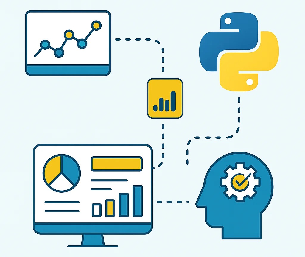
The real workflow (not a shiny diagram)
Every engagement starts with the messy truth: mismatched dates, duplicate customers, products with three spellings, and revenue booked in the wrong currency. In Python, I standardize columns, reconcile IDs, calculate business-friendly fields (margin, discounts, rolling averages), and publish the result to a lakehouse or SQL. Power BI then models the data into a star schema so measures are consistent across every page. Once the semantic layer is clean, decision-making becomes fast and boring — in the best way.
Dashboards aren’t for decoration. They must answer: What changed? Why? What should we do now? That’s the bar I hold myself to.
Case study 1: Retail margins — plugging the hidden leaks
A multi-branch retailer lived by top-line sales and quietly bled profit through discounts and slow price updates. The team spent Mondays merging CSVs; nobody had the same number twice.
I scripted a Python pipeline that unified POS exports, supplier costs, and promo calendars, then fed a Power BI model designed around Gross Margin %. The dashboard highlighted margin variance by branch, then let managers drill into SKU-level leaks: freight creep, discount stacking, and delayed cost changes.
The effect was immediate. Regional leads began each morning with a Branch Leaderboard and a short “fix list.” When margin for any branch dropped more than 1.5 percentage points week-over-week, Power BI fired a Teams alert with the offending SKUs. Within two months, they recovered 2.3 percentage points of margin — not because the dashboard looked pretty, but because it turned scattered data into obvious actions.
Case study 2: Manufacturing OEE — seeing bottlenecks, not just numbers
A mid-sized manufacturer tracked downtime in one sheet, scrap in another, and production targets in a third. When lines slipped, everyone argued about which file was “the right one.”
We connected machine counters and maintenance logs to a Python job that computed Availability, Performance, Quality, and a clean OEE for every line and shift. Power BI layered on a Downtime Pareto page that ranked root causes and a drill-through from line → shift → work order, including operator notes and photos.
Now, when OEE dipped below a threshold, supervisors received a targeted alert with the last twenty relevant events. Over 90 days, unplanned downtime fell 14%, largely by standardizing how issues were spotted and escalated. The plant didn’t hire more people or buy new machines — they simply saw the same truth at the same time.
Case study 3: Finance collections — prioritizing the next call
The CFO of a services firm got static aging reports that buried the story of who actually pays and who stalls. We used Python to score customers by on-time behavior and to tag disputed invoices. In Power BI, a Collections Cockpit ranked accounts by expected cash impact and flagged the root causes blocking payment.
Collectors started their day with a ranked “Top 20 to Call,” complete with contacts and context. Sales received automatic nudges when a dispute needed their help. Within eight weeks, DSO improved by 19% — not because anyone worked longer, but because the next best action was unmistakable.
What makes this stick inside the business
Speed where it matters. Incremental refreshes cut big data updates from hours to minutes. Near-real-time pages rely on DirectQuery or streaming only where they add value; everything else stays fast in Import mode.
One definition of the truth. The semantic model carries KPI definitions — Gross Margin %, OEE, AR Days — so marketing, ops, and finance stop debating formulas and start debating decisions.
Security without friction. Row-Level Security means a branch manager sees just their branch, a regional lead sees the roll-up, and the CFO sees everything. People stop asking for custom spreadsheets because the dashboard already respects their world.
Automation that closes loops. When a KPI breaks a rule, we don’t wait for the weekly meeting. Alerts post to Teams/Slack, a ticket gets created, and the right person is tagged with the exact slice of the data that needs attention.
From dashboard to decision
The biggest compliment I get isn’t “this looks great,” it’s “we changed something today.” A good dashboard shortens the distance between signal and action:
- The retail buyer adjusts pricing on three SKUs before lunch.
- The production supervisor schedules a preventive changeover for the chronic bottleneck.
- The collections team focuses on five accounts that actually move cash this week.
Behind the scenes, Python quietly keeps the pipes clean; Power BI keeps the story honest and fast. Together, they make a habit out of good decisions.